Shipping KPI Dashboards: 2026 Guide

Shipping KPI dashboards are becoming the “single pane of glass” for fleets because 2026 is forcing better measurement, not just better reporting: more granular IMO fuel data collection starts 1 January 2026, EU ETS coverage steps up again in 2026, and FuelEU workflows are pushing companies toward tighter, auditable monitoring plans and compliance balances.

📊

What is it and Keep it Simple...

A shipping KPI dashboard is a live scorecard that turns raw ship and voyage data into a few numbers your ops and technical teams can act on quickly. The goal is not more charts. The goal is fewer surprises: fuel drift, schedule misses, compliance exposure, and avoidable downtime.

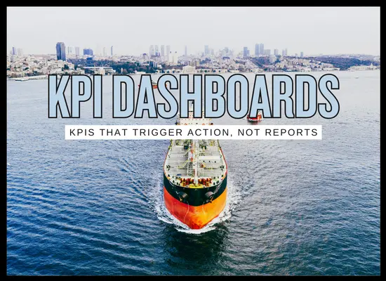
The best dashboards behave like a traffic-light board: green means “leave it alone”, amber means “watch and verify”, red means “trigger a workflow”. If it does not trigger a workflow, it is a report, not a dashboard.

In plain terms
It is one consistent view of performance across ships that combines voyage, fuel, emissions, maintenance, and schedule signals, so teams stop arguing about whose spreadsheet is correct.
Why 2026 matters
Data expectations are rising. More granular fuel reporting requirements begin in 2026, EU ETS coverage increases again, and FuelEU compliance workflows reward companies that can monitor, document, and explain performance and compliance balance clearly.
What you are really buying
  • A single “source of truth” that merges ship, voyage, and shore data
  • Alert rules that trigger actions, not just monthly PDFs
  • Evidence packs for audits, charterers, and internal management reviews
Shipping KPI dashboards: the blocks that matter in 2026 (what to track, why it helps, where it fails)
KPI block What you monitor What it tells you Advantages Disadvantages and common traps
Fuel and energy
Daily performance, consumers, and mode splits
Noon or sensors ME / AE split At-berth
  • Total fuel by voyage leg and operating mode
  • Fuel by consumer (ME, AE, boiler, cargo handling)
  • Speed, draft, and simple normalization variables
  • Who is drifting and when it started
  • Which routes or ports push consumption higher
  • Whether a change actually reduced fuel per nm
  • Catches bad weeks before they become bad quarters
  • Creates a shared picture for ship and shore
  • Makes savings claims testable, not anecdotal
  • Garbage inputs produce confident wrong answers
  • Over-normalization can hide real issues
  • Teams build charts instead of action triggers
Emissions exposure
Cost and compliance visibility by ship and lane
CO2 totals Voyage coverage Allowance planning
  • CO2 by voyage, region, and time in port versus sea
  • Coverage share and internal cost allocation rules
  • Compliance balances and surrender readiness
  • Where cost is accumulating right now
  • Which ships are outliers and why
  • What decision levers change exposure fastest
  • Turns compliance from a year-end panic into a managed number
  • Supports routing, speed, and port decisions with evidence
  • Improves audit readiness through consistent record packs
  • Ship-level and company-level views get mixed incorrectly
  • Manual spreadsheets drift and create disputes
  • Tracking totals without levers becomes a dead dashboard
CII and energy actions
Trend plus action ownership
Trend line Action log Proof
  • CII-related drivers you can actually control
  • Action list with owners and dates
  • Evidence that actions happened and had impact
  • Whether you are trending into a rating problem
  • Which actions are working versus just being reported
  • How much margin is left in the year
  • Prevents “paper compliance” by forcing ownership
  • Aligns ops and technical around the same weekly view
  • Makes improvement repeatable across sister ships
  • Teams obsess over the label and ignore drivers
  • Actions without owners become noise
  • Monthly reporting is too slow for course correction
Schedule and ports
ETA, arrival accuracy, and time loss by reason
AIS Port events Delay codes
  • Arrival accuracy and berth-window hits
  • Anchorage time, port stay, and turnaround breakdown
  • Time loss by reason code and repetition patterns
  • Where time is being lost and how often it repeats
  • Which terminals or lanes create predictable congestion
  • Whether speed choices are helping or only burning fuel
  • Fast commercial impact visibility
  • Supports better coordination with terminals and agents
  • Quantifies the value of better ETA workflows
  • Reason codes can be gamed if incentives are mis-set
  • Port data consistency varies by region
  • Time without cost context becomes a vanity metric
Hull and propulsion
Condition drift and intervention timing
Power vs speed Draft Post-cleaning check
  • Power increase at constant speed trend
  • Hull and prop “drift” indicators from ops data
  • Cleaning events and measured return-to-baseline checks
  • When hull and prop are silently costing you money
  • Whether a cleaning worked or was just activity
  • Which ships need tighter cadence based on drift
  • Supports disciplined maintenance instead of guesswork
  • Reduces late cleanings that create big fuel penalties
  • Helps vendor management with objective outcomes
  • Needs stable baselines and consistent methodology
  • Short-term weather and routing noise can confuse teams
  • Poor sensor coverage limits precision
Reliability and maintenance
Downtime risk before it hits off-hire
CMMS Condition signals Spare lead time
  • Critical equipment faults and repeat failures
  • Overdue maintenance and deferral risk
  • Spare parts backorders and lead time exposure
  • Which ship is sliding toward downtime
  • Where repeat faults indicate root-cause gaps
  • Which spares will strand you operationally
  • Direct link to off-hire prevention and safety margin
  • Improves planning for yard scope and spares budgets
  • Creates clear accountability for closure and follow-up
  • CMMS quality varies and can mislead leadership
  • Counting work orders hides severity and criticality
  • Dashboards can reward activity, not reliability
Safety and operational risk
Leading indicators and closure quality
Near misses Corrective actions Closure quality
  • Near-miss volume with severity weighting
  • Audit findings closure and aging
  • Repeat patterns by ship, operation type, and route
  • Where risk is rising quietly before an incident
  • Whether corrective actions actually stick
  • Which operations need training and procedure focus
  • Improves prevention through leading indicators
  • Supports consistent safety management across fleets
  • Makes audits less painful through steady closure discipline
  • Bad culture makes reporting meaningless
  • Pure counts can punish honest crews
  • Speed of closure can beat quality unless defined
Commercial and claims
Margin leakage and dispute drivers
CP terms Performance vs terms Claims patterns
  • Speed and consumption versus contractual terms
  • Claims drivers and repeat root causes
  • Port time versus benchmarks and demurrage exposure
  • Where margin leaks through underperformance
  • Which disputes are predictable and preventable
  • Whether ops decisions match commercial intent
  • Connects ops reality to finance outcomes
  • Supports proactive claims prevention
  • Helps justify investments that reduce disputes
  • Contract data is messy and definitions vary by CP
  • Dashboards get political if they only assign blame
  • Without standards, comparisons become arguments
Data health
The dashboard that keeps the dashboard honest
Completeness Timeliness Outliers
  • Missing fields and late submissions by ship
  • Outlier detection for fuel, speed, and events
  • Version control and audit trail of edits
  • Whether you can trust what you are looking at
  • Which ships or vendors need data discipline help
  • Where errors are being introduced in the pipeline
  • Prevents leadership from steering using bad numbers
  • Raises adoption because users trust the view
  • Reduces time wasted on “spreadsheet debates”
  • Often skipped because it is not flashy
  • If you do not define standards, everyone defines their own
  • Too many checks can slow reporting if overbuilt
Simple rule: pick 8 to 12 KPIs that trigger actions, assign an owner to each trigger, and keep a short evidence trail. If a KPI does not change a decision, it should not be on the main dashboard.
🧪

Shipping KPI dashboards: what is really working

1) Triggers, not charts
The best dashboards behave like a control room. A KPI crosses a threshold and a workflow starts: verify data, assign owner, document action, confirm improvement. If nothing happens after a red flag, the dashboard becomes wallpaper.
2) A small set of KPIs that match decisions
The practical sweet spot is 8 to 12 KPIs on the main view. Fuel drift, port time loss, overdue critical maintenance, and emissions exposure are common anchors. Everything else lives in drill-down views.
3) Data health is treated as a KPI
Working programs track missing fields, late submissions, and outliers. This prevents leadership from steering using bad numbers and reduces time wasted on spreadsheet debates.
4) One owner per trigger
Dashboards stick when every trigger has a named owner and a time window. For example: fuel drift goes to technical, port time loss goes to ops, recurring claims go to commercial.
5) Evidence packs are automatic
Teams stop arguing when the dashboard can show inputs, edits, and a short trail of actions taken. This becomes valuable for audits, internal reviews, and customer questions.
Fast test in 60 seconds
Ask a superintendent to open the dashboard and answer three questions quickly: Which ships are drifting, why, and what action is assigned today. If they can do that without digging through tabs, it is working.
Shipping KPI dashboard ROI tool (clean 20-second estimate)
Used to scale time savings and operational impact across the fleet.
Less manual reporting, fewer spreadsheet merges, faster reviews.
Blended shore cost, or use a realistic internal hourly value.
Used only for a small drift reduction estimate.
Keep conservative. This is improved detection and follow-up, not magic fuel savings.
Schedule, missed windows, repeated port issues you can actually reduce.
Use a blended internal value: berth window, overtime, knock-on cost, off-hire risk.
Licensing, support, data fees.
Integration, configuration, training, and rollout effort.

Annual labor value

$0

Annual fuel value

$0

Annual delay value

$0

Total annual benefit

$0

Net annual benefit (after annual cost)

$0

Payback (months)

n/a

This is a quick sensitivity estimate. The most realistic wins usually come from time saved and fewer repeat operational issues. Treat fuel improvement as conservative unless you can show repeatable interventions that change outcomes.

A good KPI dashboard program is usually obvious within a few weeks: fewer manual status chases, fewer repeated operational surprises, and quicker agreement on what happened and what to do next. If the numbers are trusted and the triggers have owners, the dashboard becomes part of daily rhythm instead of another report people open only during monthly reviews.

We welcome your feedback, suggestions, corrections, and ideas for enhancements. Please click here to get in touch.
By the ShipUniverse Editorial Team — About Us | Contact